For this concept, the client is a fantasy author. He has released a few books before comprising of two different series, and now he was starting on his new third series of medieval fantasy books named Gold and Glory. In the first book, we meet the series' protagonist and read about his origin story of how he started as a mercenary before he went on a journey and rose to power as a king.
The client wants a strong and eye-catching book cover design so he can have his book published. My goal is to design the front cover, back cover, and the spine of the book.
To start, I searched for some royalty-free assets that I planned on using on the front and back cover, as well as did some research on the type of typeface I would want to be used prominently on the cover. I wanted the cover to feature the protagonist primarily, as well as to focus on a gold color.
I eventually settled on the typeface "Ringbearer" for it's medieval feel while still being easily legible. Below are the three royalty-free images I found that would be used in the book's cover: one is a knight, and another is a picture of two bags of gold coins. These images were chosen to reflect the book's themes, as it's about a mercenary who originally was in his line of work for the gold, but over the course of the book shifted his priorities as his journey to become king took priority.
I also planned to use an image of the sky as part of the background to give the cover some depth on the front, back, and spine.
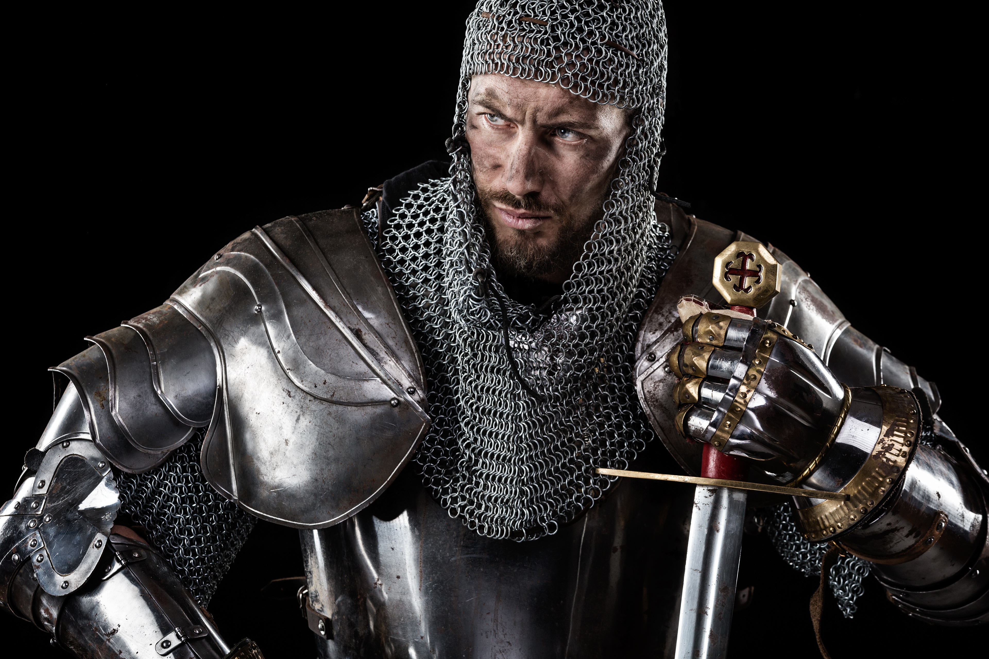


Now that I had the images for the cover, it was time to put together the cover itself. Starting with the front cover, I decided that due to the focus on gold that was planned on, I decided that the knight would have the color from the image removed, and his eyes should be changed to gold, as well as the gold on his gauntlets and sword should be highlighted more.
Combining this with the background I chose, I did the same thing, where I removed the color and applied a faint gold gradient on the bottom of the cover, as well as somewhat lowering the opacity of the knight. This works together to add a nice depth to the cover and emphasize gold as the only visible color without making it too strong.
I also decided to give the cover a border, only letting the image of the sky show on the edges instead of letting the full image stretch across the entire length, which also adds to the depth when placing a dark rectangle with a somewhat lowered opacity to contain the other elements of the cover. The title and tagline was placed at the bottom, and I made the text white to stand out among the background elements and make it legible.
For the back cover, I used the image of the two bags of gold coins and gave it a border like the front cover to keep the same theme going across the book. The bags of gold coins didn't need any additional editing, so I lowered the opacity for the image so it didn't make the text that I placed over it harder to read. The barcode was added to simulate what the back cover would look like when it's on store shelves for sale.
The spine was the last image I designed. Once again, I kept the border consistent with the other two images and added the book's title and author.
The cover was finished! Placing them all side by side shows the consistent theme across the different images, and how the background stretches across the entire cover..
I put together a 3D mockup afterwards, placing the images on a 3d book so the front, back, and spine of the book can be visible.
