For this concept, the client is is the owner of "Modern Memories", an antique store that that buys and sells antiques, and they also take custom orders to make hand-crafted wooden furniture. They tend to have a lot of older customers, collectors, vintage home owners, and customers nostalgic for the past.
This is a small store owned and run by one man, and he has never advertised his business before, relying more on word of mouth. He wants to try advertising to a larger audience, so my goal is to make a logo, billboard, and business cards to help advertise the store to the local populace.
Starting with the logo, I wanted to make a logo that had a "vintage" feel but not too far in that direction. One thing I believe would really express the feel I was going for was to use a typeface that felt vintage. After some searching, I settled on a typeface called "Black Drama" and made part of the logo, choosing to make it a pale yellow color.
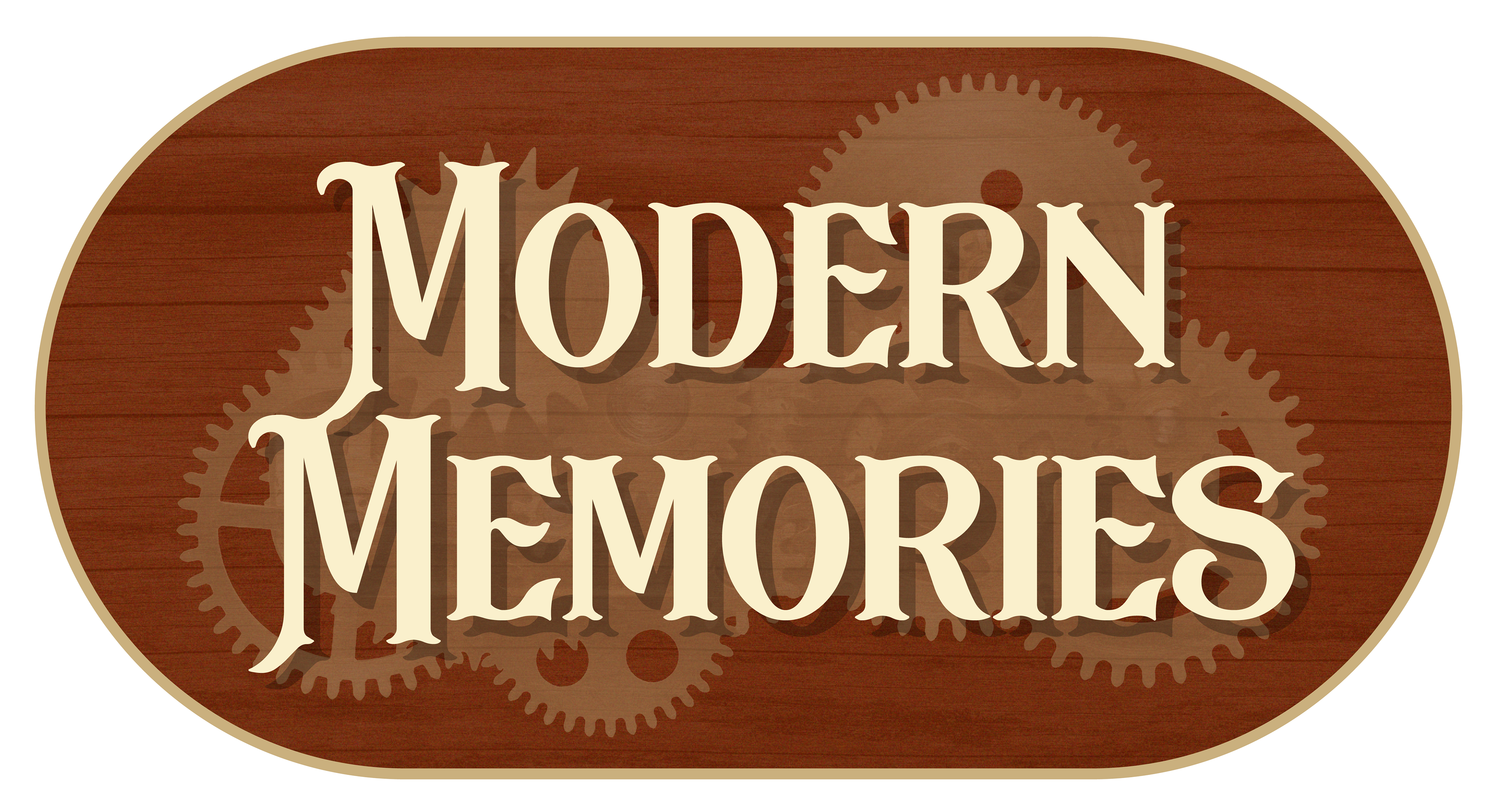
I felt that the logo needed a little more, so I decided to make an alternate version with a background. Wood came to mind due to one of the store's offered services of hand-crafted wooden furniture, and wood also makes me think "old" or "rustic".
I was stuck between two different logos where one had transparent gears in the background and the other was just a wooden background. I eventually decided to go with the pure wooden background for a simpler, cleaner logo. The deeper brown of the wood contrasts nicely with the pale yellow of the text and border.

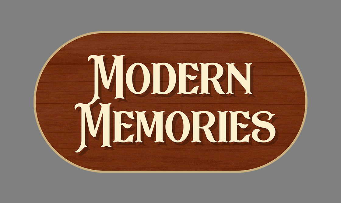
After deciding on the logo, I worked on the business cards next. I made two different images, one for the front, and one for the back. I kept the cards simple by just using the full logo on the back of the card, and the text logo on the front with contact information. A brown bar on the right was added to the front of the card to prevent it from being too plain.
After designing the cards, I also used a 3d mockup to give a better look at what the cards could look like when they are printed.
Lastly, I designed the billboard. My goal was to make it quick and easy to read with a simple call to action. After I found a good stock image that works for an antique store, I put the billboard together by having the right side be the stock image while the left is the call to action and the logo. I also made the background blue because it was a good complimentary color, and would pop on a billboard to grab attention when mixed with the large text of the call to action.
To finalize the project, a 3d mockup of the billboard was made as well, using a royalty-free dark sky background to help visualize what the billboard could look like at night.

